
Sling TV, which has been updating its look on Fire TV devices over the past few weeks is launching the new version of the app on Roku Ultra devices today. While not all Roku Ultra owners will see the update immediately the top of the line devices are the first in the Roku family to receive the new look app.
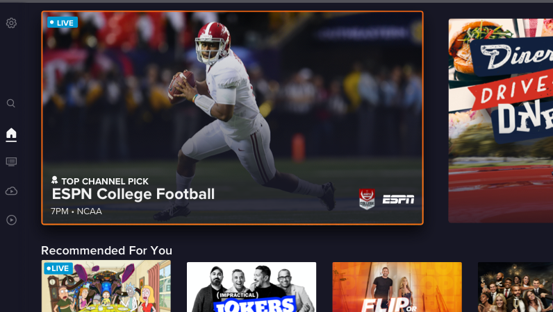 Sling’s new approach put more of the focus of the app on a vertical menu based on the left side of the screen which is a departure from the horizontal menu based on the top of the screen that has been in place since Sling TV started the whole cable channels without cable trend. The company says that the new setup will be easier for customers to use, though for longtime users it will mean an adjustment.
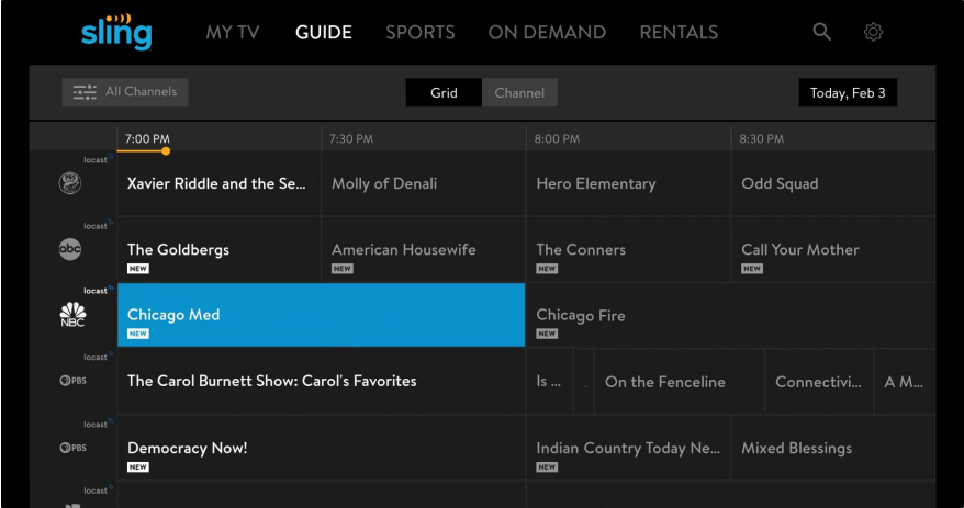
Sling TV still includes the main features that made the service what it has been. For instance it allows subscribers to use a traditional program guide as well as dive in further into a given network to see what is available from the channel itself on-demand. Though one change is that the “Channel View” is no longer available. There are also fewer rows of settings, which simplifies the look and feel of the service overall.
The new Sling TV app has four basic menu categories Home, Guide, DVR and On-Demand. Each is represented by an icon meaning there are simply less words on the screen when users navigate. It allows the app to look more like a TV based option and less like a web page on a TV Screen, which is the sort of effect one gets with text-based menus along the top of a screen.
As of right now only Fire TV and Roku Ultra devices will see the new look for the service but users can expect to see the new interface on the full lineup of Sling TV supported devices which includes Android TV, Apple TV, LG TV (Web OS), Samsung TV (TISEN) Apple TV and Android TV.